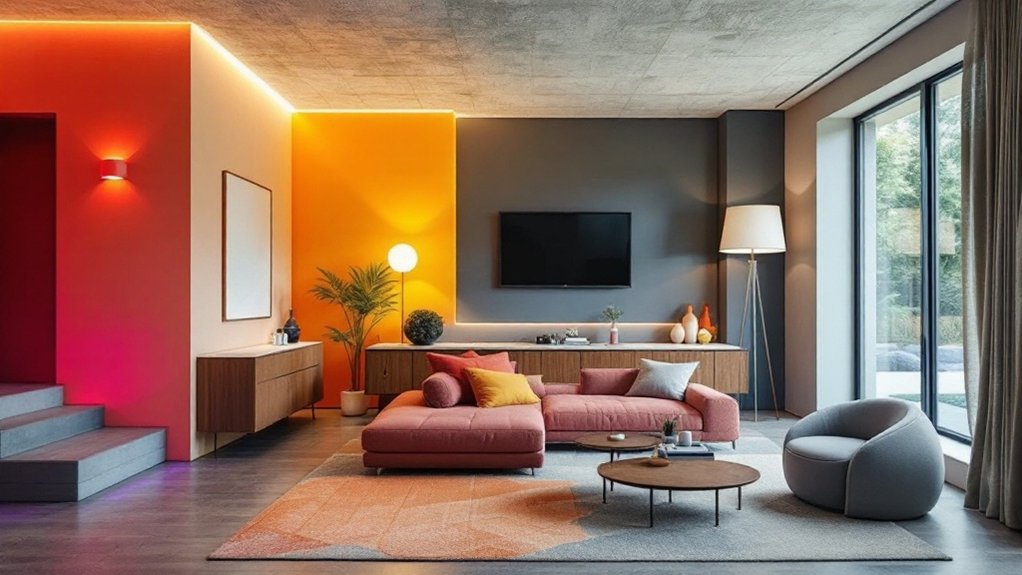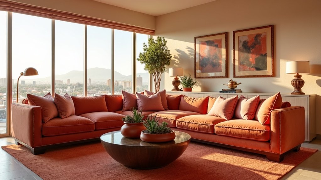
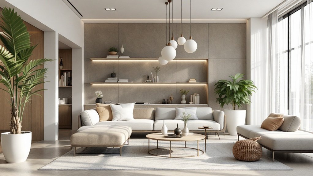
Professional pattern mixing in interior design relies on strategic layering of three to five different prints at varying scales. Designers recommend starting with one large-scale anchor pattern, then incorporating medium and smaller-scale designs within a coordinated color family. Thoughtful placement and proportion create visual harmony, while woven textiles add crucial texture. Success comes from balancing bold foreground elements with recessive background applications—a skill that transforms with experience and careful orchestration.
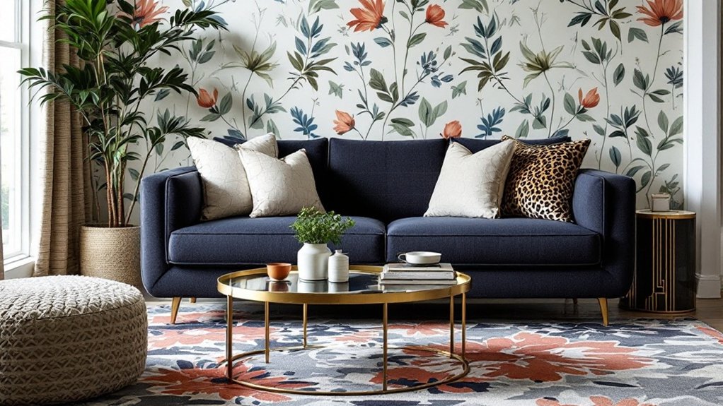
While many interior design elements require careful consideration, the art of mixing prints stands out as both a challenging and rewarding endeavor that can transform ordinary spaces into visually dynamic environments. Successful pattern mixing relies heavily on understanding scale and proportion, with designers typically incorporating three to five different pattern scales within a single space. The fundamental approach begins with selecting one large-scale pattern to serve as an anchor, complemented by medium and smaller-scale designs that create visual harmony. The inclusion of woven textiles adds essential textural depth to the overall design scheme. Focusing on the concept of happy clashing, successful designers embrace unconventional pattern combinations to create unique and personalized spaces.
Pattern mixing transforms spaces through careful orchestration of scale, creating visual interest that elevates interior design from mundane to magnificent.
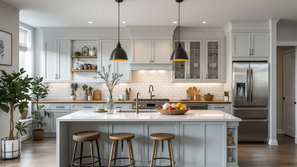
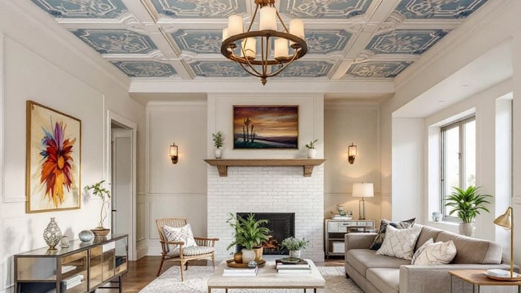
Interior designers emphasize the importance of considering existing architectural patterns, such as wooden floorboards, exposed brick, or fireplace details, before introducing additional prints. As designer Penny Morrison suggests, bringing fabric samples directly into the space provides essential insight into how different patterns will interact within the intended environment. For novice pattern-mixers, limiting combinations to three different prints offers a manageable starting point, while experienced designers like Charlotte Gaisford confidently incorporate up to five pattern types in well-balanced rooms.
Color coordination plays a vital role in successful pattern mixing, though designers caution against using identical shades across different patterns. Instead, they recommend varying tints and shades within the same color family to create depth and sophistication. This approach, combined with strategic pattern placement throughout the room, guarantees balanced visual flow and lasting appeal.
Designer Sophie Ashby's masterclass approach demonstrates how patterns should be distributed between prominent foreground elements and more recessive background applications.
The pattern selection process begins with a thorough inventory of desired and existing patterns, followed by careful experimentation with combinations and placements. Kit Kemp's renowned pattern-mixing techniques illustrate the importance of viewing combinations under varying light conditions and allowing time between editing sessions to gain fresh perspective.
Success in pattern mixing often comes from understanding that while the magic number typically starts at three different prints, the key lies in thoughtful coordination of scale, color, and placement rather than adhering to strict numerical rules.
Frequently Asked Questions
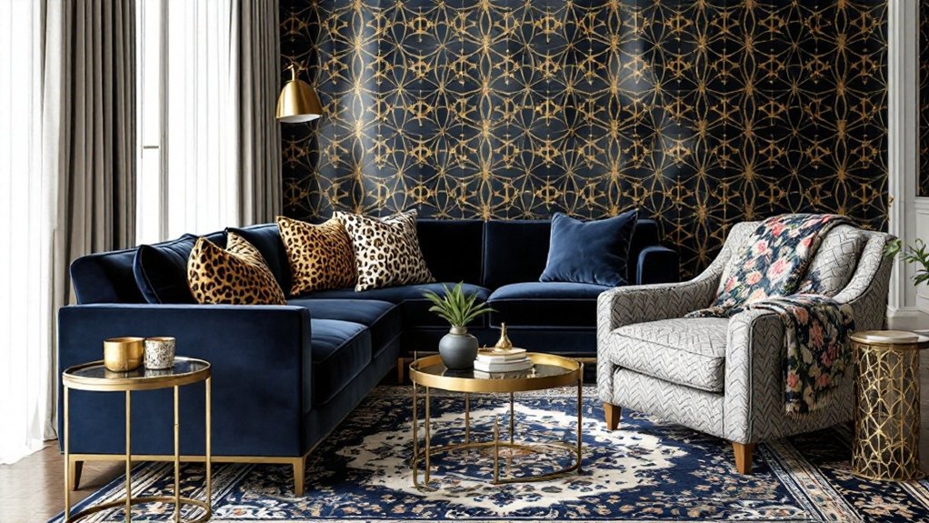
How Do I Incorporate Animal Prints Without Making the Room Look Tacky?
To incorporate animal prints elegantly, designers recommend using them sparingly as accent pieces rather than dominant elements.
A leopard print pillow or zebra ottoman can add sophistication when paired with neutral colors like beige, gray, or white.
Strategic placement of smaller items, such as throws or lampshades, prevents overwhelming the space.
Mixing prints of different scales while maintaining a unified color palette guarantees a refined, rather than garish, aesthetic.
What's the Ideal Number of Different Patterns to Use in One Room?
Interior design experts usually recommend limiting a room to three distinct patterns to maintain visual harmony and sophistication.
This "rule of three" typically encompasses one large-scale statement pattern, one medium-scale complementary design, and one small-scale accent pattern.
When these patterns share a unified color palette and vary in scale and density, they create a balanced, professional aesthetic without overwhelming the space.
Additional patterns can be introduced through subtle textures and solid fabrics.
Should I Match Patterns Across Different Floors of My Home?
While exact pattern matching across floors isn't necessary, coordinating patterns through a consistent color palette and overall design theme creates visual harmony throughout the home.
Interior designers recommend selecting complementary patterns that share common elements while varying in scale or complexity.
Proper transitions between floors, such as coordinated landing areas or hallways, help bridge different patterns seamlessly.
The key is maintaining cohesion while allowing each floor to express its unique character within the home's broader design narrative.
Can I Mix Vintage and Modern Prints in the Same Space?
Mixing vintage and modern prints can create a visually dynamic and sophisticated space when executed thoughtfully.
Design experts recommend selecting prints that share at least one common element – whether it's color, scale, or motif – to maintain cohesion.
For ideal balance, pair bold vintage patterns with subtle modern designs, or vice versa.
The key is to establish a clear hierarchy among prints while ensuring they complement rather than compete with each other.
How Do I Coordinate Patterns Between Indoor and Outdoor Living Spaces?
Coordinating patterns between indoor and outdoor spaces requires a thoughtful approach to create visual harmony.
Designers recommend selecting complementary prints that share common elements like color palette, scale, or motif. Natural patterns such as botanicals, geometrics, and organic textures work particularly well in transitional spaces.
The key is maintaining consistency while allowing each area to have its distinct personality – perhaps using larger-scale prints outdoors and more refined variations of the same pattern family indoors.