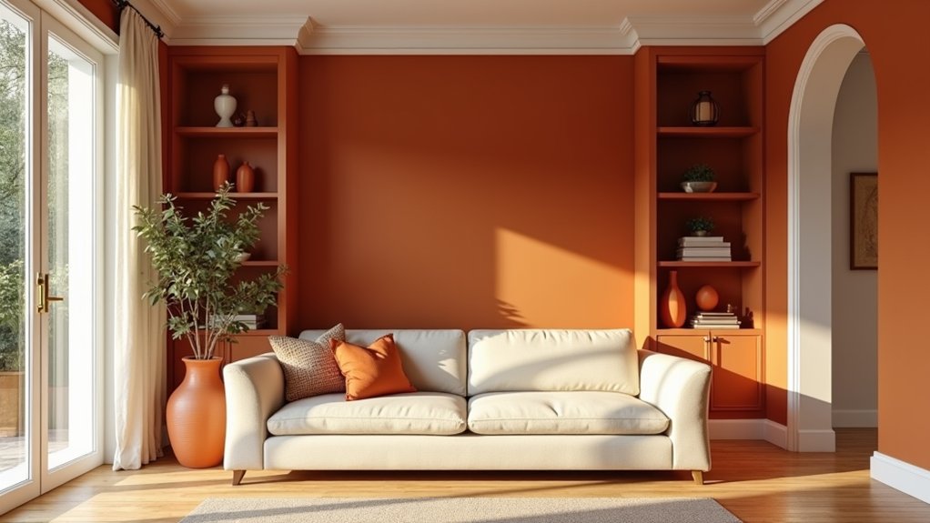
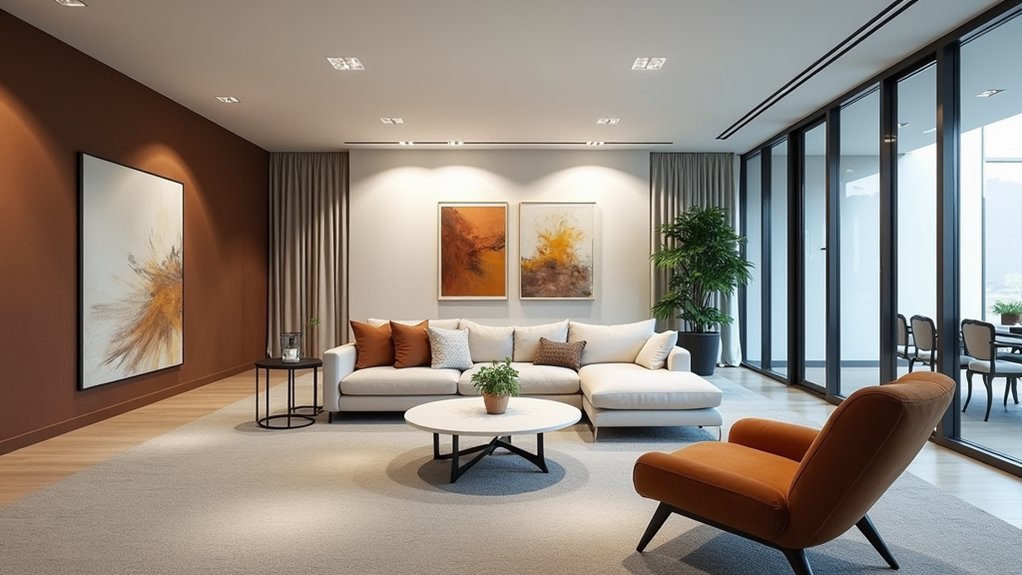
Within the domain of visual aesthetics, monochrome design stands as a powerful testament to the principle that limitation breeds creativity. Originating from the Greek words "mono" (one) and "chrome" (color), this design approach harnesses the power of a single hue through its various tints, shades, and tones to create sophisticated and unified visual experiences that transcend simple color restrictions.
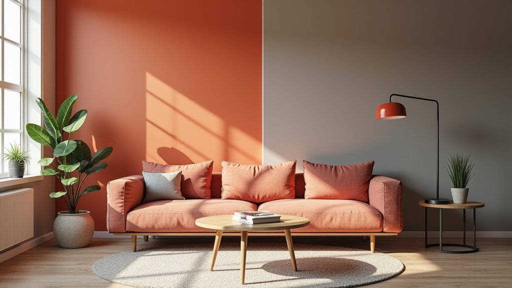
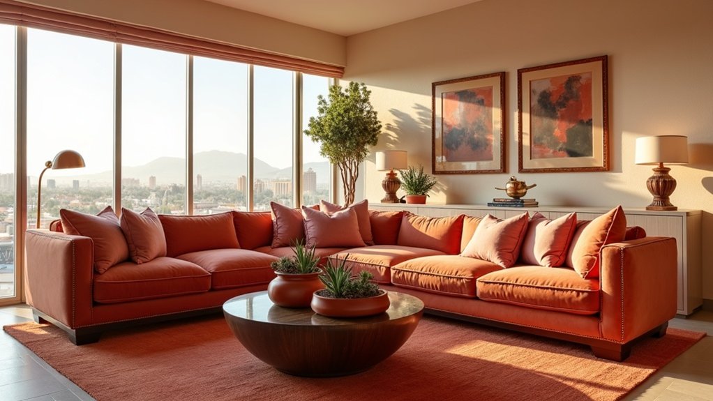
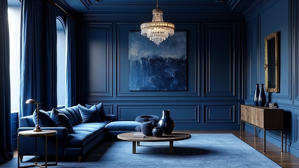
The transformative potential of monochrome design lies in its ability to create depth through careful manipulation of a single color's spectrum. By incorporating tints (adding white), shades (adding black), and tones (adding gray), designers can craft spaces that feel both integrated and dynamic. "Monochrome design isn't about limitation; it's about exploration within boundaries," notes renowned interior designer Marcus Chen, highlighting how this approach can actually expand creative possibilities rather than restrict them. The successful execution of monochrome spaces relies heavily on key design elements like lighting, texture, and pattern variation.
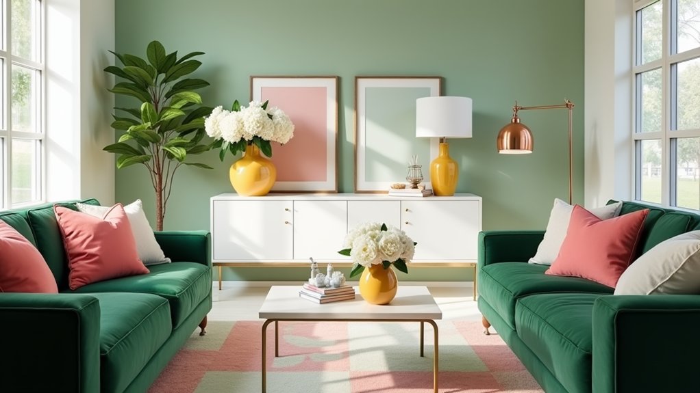
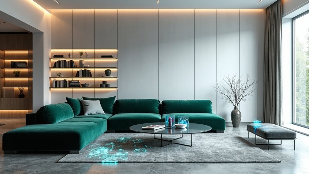
The psychological impact of monochrome spaces proves particularly compelling in contemporary environments. These designs naturally evoke feelings of calmness and sophistication while reducing visual clutter and cognitive overload. In commercial spaces, monochrome schemes have been shown to increase focus and productivity, while in residential settings, they create sanctuaries of serenity and visual harmony. The understated aesthetic of monochrome designs contributes significantly to their calming effect on viewers.
Contemporary applications of monochrome design extend beyond mere color selection. Texture, material variation, and light play essential roles in preventing monotony and creating visual interest. For instance, a blue monochrome room might incorporate velvet upholstery, glossy ceramic tiles, and matte wall finishes, all within the same color family but offering distinct tactile and visual experiences.
The versatility of monochrome design makes it particularly relevant in today's design environment, where adaptability across different mediums is vital. Whether in digital interfaces, physical spaces, or brand identities, monochrome schemes offer practical benefits including streamlined decision-making processes and improved brand recognition.
This approach proves especially valuable in creating accessible designs, as the natural contrast within monochrome palettes can improve visibility and user experience when thoughtfully implemented.