Every successful interior design project begins with a thorough understanding of color theory and its practical applications in spatial design. When working with purple, a color traditionally associated with luxury and creativity, designers must carefully consider which colors to pair it with to avoid visual discord. The psychology of color plays an essential role in creating harmonious spaces, and certain color combinations with purple can create tension rather than balance. Personal preferences greatly impact how individuals respond to color combinations in their living spaces.
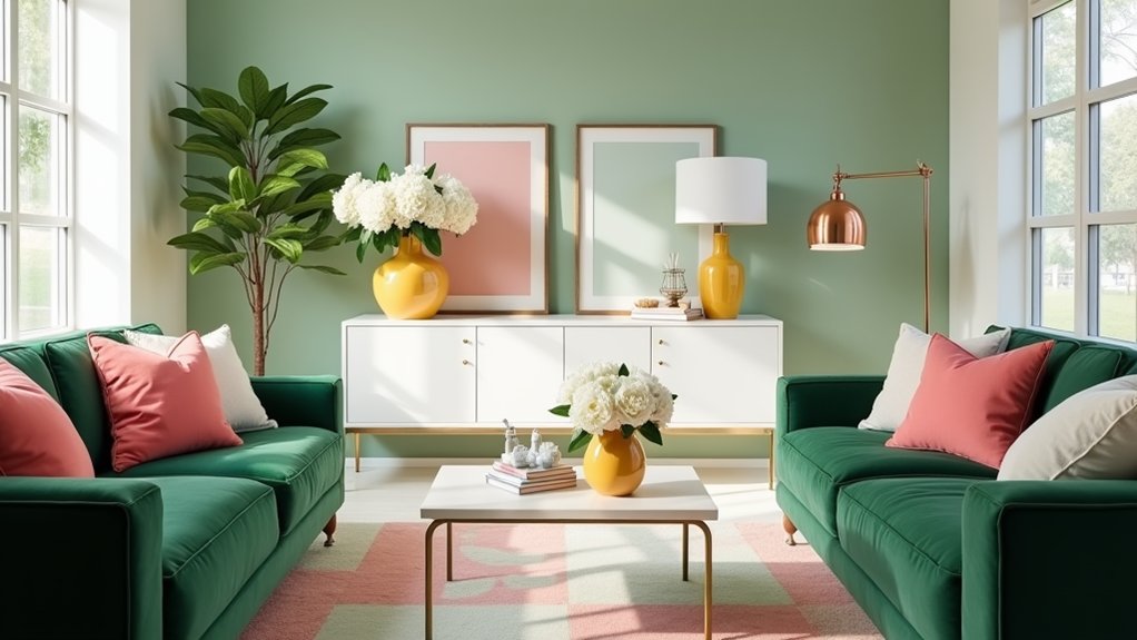
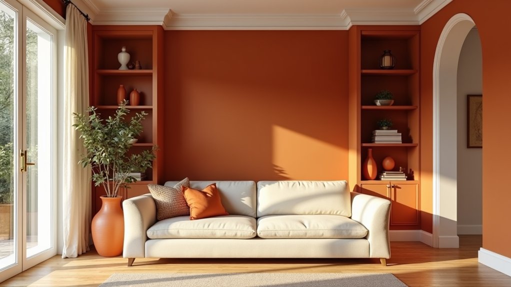
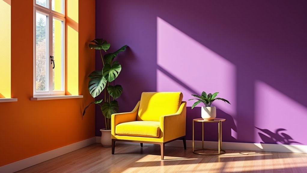
Strong yellows and oranges often clash with purple because of their opposing temperatures and similar intensity levels. Interior design expert Sarah Chen notes, "When pure purple meets similarly saturated warm colors, they compete for visual dominance, creating an unsettling effect that can make occupants feel uncomfortable." Instead, designers recommend using muted versions of these warm colors or incorporating them as small accents, following the three-color rule of 60-30-10 distribution.
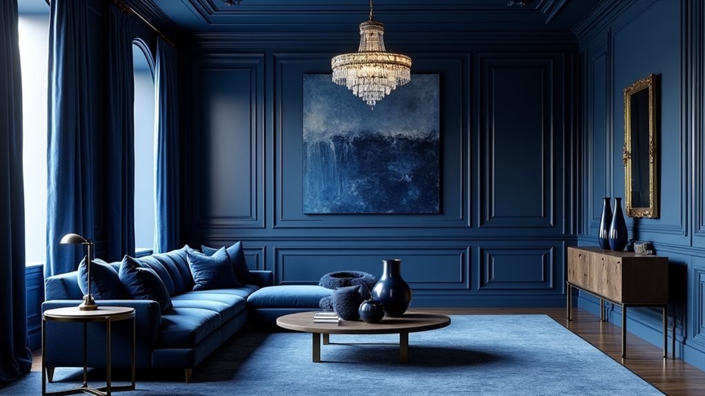
Purple's relationship with other colors on the color wheel requires careful consideration of hue, value, and intensity. Colors that typically clash with purple include certain greens and browns, particularly when their saturation levels match purple's intensity. The solution often lies in adjusting the value or intensity of one color to create a hierarchy. For example, a deep aubergine purple can work harmoniously with sage green, while bright purple and emerald green might create visual tension. Designers often turn to the color wheel basics established by Sir Isaac Newton to make informed decisions about color combinations.
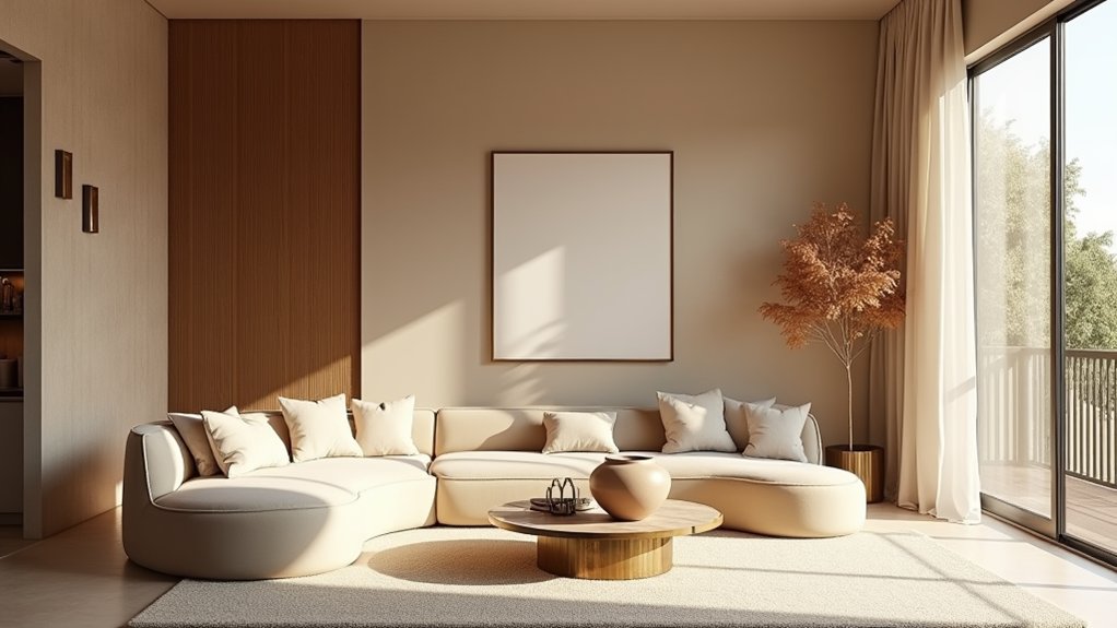
Professional designers often rely on neutrals to mediate potentially clashing combinations. "Using transitional tones and neutral bridges can help integrate purple into challenging color schemes," explains interior architect Michael Roberts. When working with purple, designers should consider using gray, taupe, or white to create visual breaks between potentially conflicting colors. This approach allows for more flexibility in color selection while maintaining design unity.
Understanding color wheel fundamentals helps predict and prevent clashing combinations. While purple can be challenging to work with, its successful integration depends on thoughtful consideration of color properties, proportional distribution, and the strategic use of neutrals. By applying these principles, designers can create sophisticated spaces that capitalize on purple's luxurious qualities while avoiding problematic color combinations.