Jewel tones are experiencing a dramatic resurgence in interior design, transforming ordinary spaces into luxurious sanctuaries. These rich hues, inspired by precious gemstones like emerald, sapphire, and amethyst, offer both drama and refinement when strategically incorporated through statement pieces and thoughtful accents. Design experts note their dual capacity to energize and calm spaces, particularly when balanced against neutral backgrounds. From velvet upholstery to artistic tile work, these timeless colors provide sophisticated options for creating personalized, regal environments that reflect evolving design preferences.
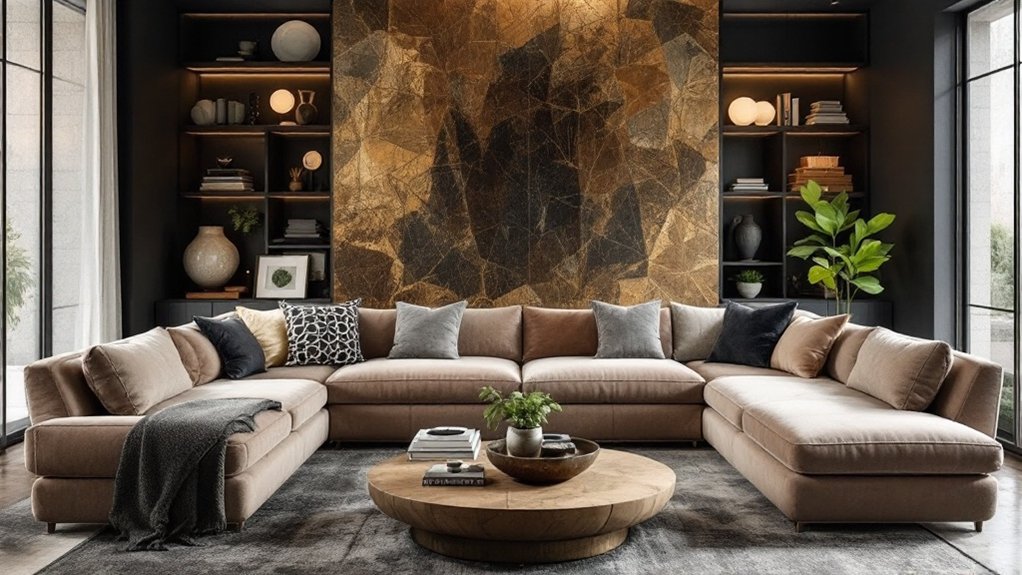
Every interior designer knows that jewel tones possess an unmatched ability to transform ordinary spaces into extraordinary sanctuaries of sophistication. Drawing inspiration from precious gemstones, these rich hues – including emerald green, sapphire blue, amethyst purple, ruby red, and topaz yellow – continue to dominate interior design trends in 2025, offering a perfect balance of drama and refinement. These stunning colors have gained significant momentum due to pandemic home trends, with many homeowners seeking bold, expressive designs for their living spaces.
The enduring appeal of jewel tones lies in their versatility and psychological impact. When paired with earthy neutrals, these saturated colors create spaces that feel both grounded and luxurious. "Jewel tones have the unique ability to make a room feel simultaneously energizing and calming," notes leading design publications, pointing to the restorative qualities of emerald green and the creative inspiration sparked by amethyst purple. Incorporating butter yellow pastels can help achieve a more balanced and serene atmosphere in jewel-toned spaces.
Jewel tones transform spaces beyond mere aesthetics, creating environments that soothe the soul while igniting creative energy and sophisticated ambiance.
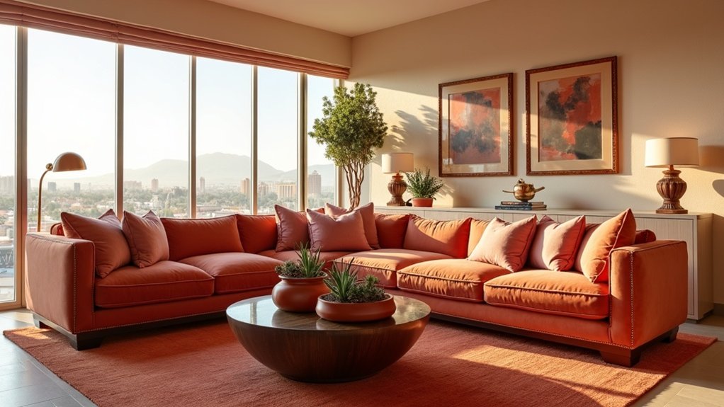
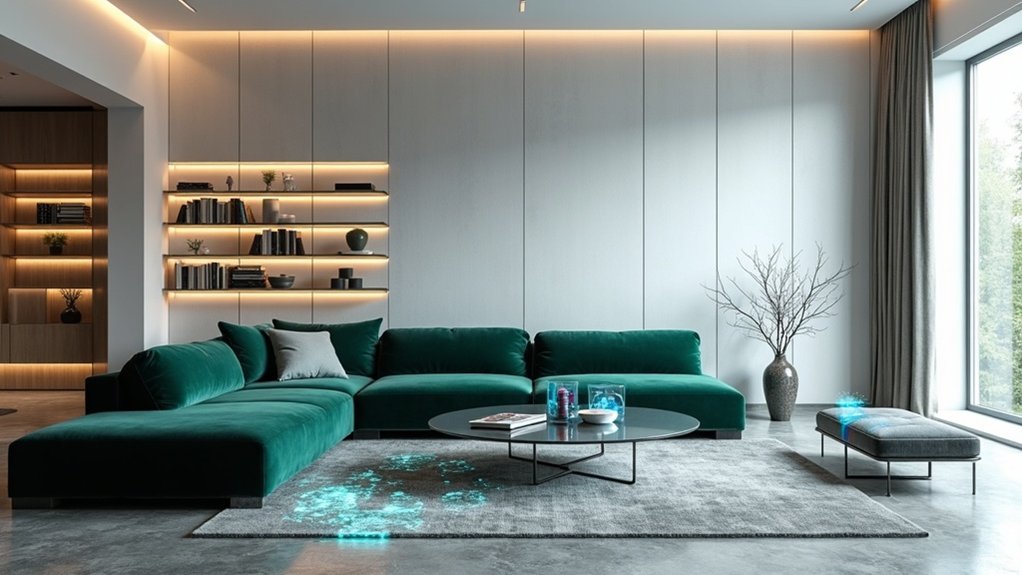
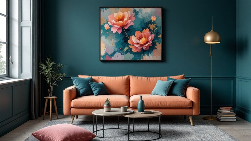
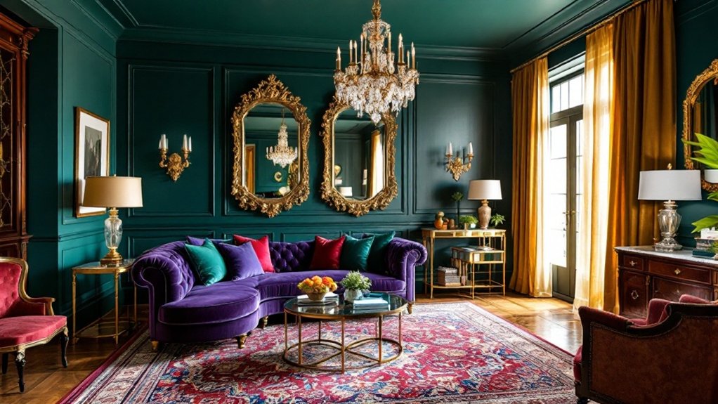
In contemporary applications, designers are incorporating these rich hues through strategic placement and thoughtful material selection. Velvet upholstery in deep sapphire adorns statement sofas, while emerald green tile work transforms kitchen backsplashes into artistic focal points. Ruby-red pendant lights suspended over dining tables create intimate atmospheres, demonstrating how jewel tones can improve both form and function.
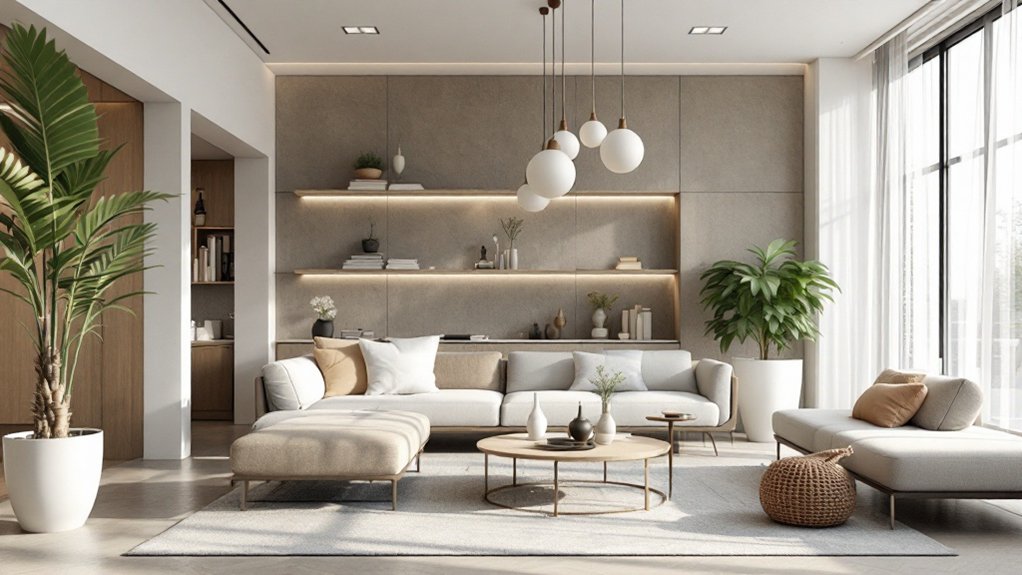
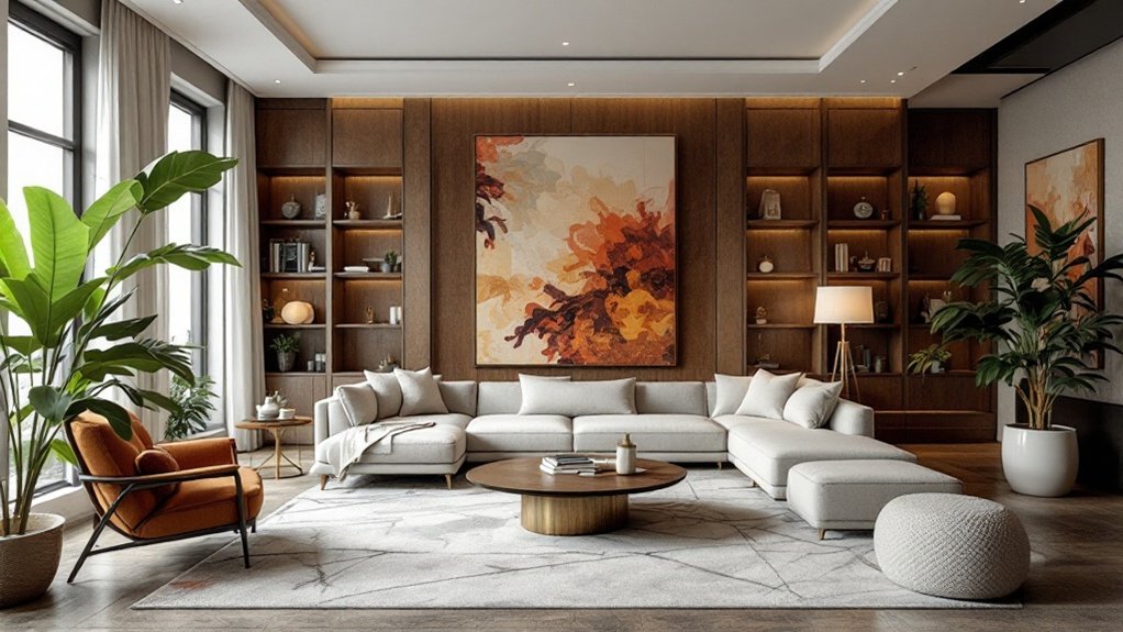
The key to successful implementation lies in moderation and balance. Designers recommend using these bold colors as accent pieces against neutral backgrounds, allowing their innate vibrancy to shine without overwhelming the space. This approach has proven particularly effective in both modern and traditional settings, where jewel tones add depth and personality while maintaining sophisticated aesthetics.
Market trends indicate that the popularity of jewel tones shows no signs of waning. Their ability to blend with evolving design preferences and create personalized environments has secured their position as a timeless choice in interior design.
Whether expressed through plush textiles, decorative accessories, or architectural elements, jewel tones continue to engage homeowners and designers alike, offering a perfect fusion of classic luxury and contemporary style. The combination of their visual impact, emotional resonance, and design versatility guarantees their place in the pantheon of enduring interior design elements.
Frequently Asked Questions
How Do I Prevent Jewel Tones From Making My Small Room Feel Darker?
To prevent jewel tones from darkening a small room, strategic pairing with light elements is crucial.
Incorporating neutral colors like white or cream for larger surfaces, while reserving jewel tones for accent pieces, helps maintain brightness.
Layered lighting sources, reflective surfaces such as mirrors and metallics, and glass accessories effectively amplify both natural and artificial light.
Furthermore, selecting lighter window treatments and incorporating varied textures creates depth without compromising luminosity.
Can Jewel Tones Work Well in Minimalist or Scandinavian-Style Interiors?
Jewel tones can certainly complement minimalist and Scandinavian interiors when thoughtfully integrated.
The key lies in strategic placement and balanced application – using these rich hues as considered accent pieces rather than dominant elements. A sapphire velvet chair or emerald glass vase can add sophistication while respecting minimalist principles.
When paired with natural materials and neutral backgrounds characteristic of Scandinavian design, jewel tones create elegant focal points without overwhelming the space's essential simplicity.
Which Jewel Tones Are Best for South-Facing Versus North-Facing Rooms?
South-facing rooms benefit most from cooler jewel tones like emerald green, sapphire blue, and plum, which help balance the warm southern light while maintaining vibrancy.
Conversely, north-facing rooms require warmer jewel tones such as ruby, garnet, and topaz to counteract the cooler natural light.
These warmer hues inject much-needed warmth into spaces with limited direct sunlight, preventing them from feeling cold or sterile.
Are Jewel-Toned Walls Suitable for Homes That Will Be Listed for Sale?
While jewel-toned walls can add personality and drama to a home, they typically aren't recommended when preparing a property for sale.
Real estate experts consistently advise that neutral paint colors appeal to the broadest range of potential buyers, who prefer a blank canvas to envision their own style.
If jewel tones are present, they should be limited to accent walls in private spaces like bedrooms or home offices, while keeping main living areas and flow spaces neutral.
How Often Should Jewel Tone Interior Trends Be Updated or Refreshed?
Jewel tone interior updates typically follow a multi-tiered refresh schedule. Major renovations occur every 5-7 years, while seasonal adjustments can maintain vibrancy between larger updates.
Design experts recommend annual metallic accent refreshes to revitalize existing jewel tone schemes. Cultural and regional factors influence timing, with traditional homes benefiting from longer 7-10 year cycles, while urban spaces tend to update every 2-3 years.
Sustainable practices favor these enduring colors for their timeless appeal.